Every website owner wants user engagement but how can they achieve it? These days competition in the market is fierce with little or no prospects of do-overs. Website users have a plethora of options to choose from and hence it is absolutely essential that websites be designed in a way that they are easy to use, attractive, engaging and assist your visitors at every step of the way. By making websites more user-friendly you can captivate the attention of your target market, retain customers and therefore drive sales as well as company growth. Here we’ve lined up seven ways in which your website can become more user-friendly:
1. A logical layout

Customers take around 50 milliseconds to develop an impression about a website after they first land on it and according to a research by Google; users not only find simpler websites more aesthetically pleasing they also prefer stereotypical website layouts that conform to the respective industry’s best practices as opposed to complex layouts.
Hence, it is imperative that tremendous thought is put into the site’s organization so that even first-time users have no difficulty navigating it.
2. Search and navigation
A way to uplift your website’s usability is to make use of a clearly visible and always present search tab. By doing so your users will be able to find anything that interests them with ease. Moreover, usability can be increased manifold by using search tabs that make predictions and recall previous searches. This is important since according to statistics; nearly 30% website visitors make use of search tabs to find information.
It is also recommended that a main all-incompassing navigation tab is present across all your web pages. Moreover, the navigation tab should provide access to all significant pages in your website and since the top left a corner of websites receive the most attention; it is recommended that the search, as well as navigation, be placed in this location. They should be designed in a manner that enables them to pop-out i.e. users should be able to easily locate them. Read out all important elements while you design your website.
3. Rich content quality
Content on any website is crucial as it gives users a reason to stay and keep coming back. In order to make your website user-friendly; it is recommended that you devise content that is thoroughly in line with your company’s branding strategy. It is also advisable that you conduct rigorous market research to identify terminologies that your target audience generally uses. This will make it easier for users to understand and relate to your content. Moreover, the specific focus needs to be made in order to make content as concise as possible.
4. Web design recommendation

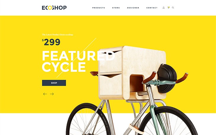
In today’s competitive industry; it is extremely important to have a visually appealing web design. High-quality web design is an instantaneous indicator of high quality and can play a crucial role in motivating a user to stay on when they initially land on your website. Moreover, it is also direly important that your web design project your company’s image and branding strategy so that from the moment that visitors land on your website they are able to get a feel of what your company is all about. This can be done by using the colors of your company’s logo as the theme for your website. It is also recommended that you use minimalist approach while designing your website as it will allow your visitors to focus on what’s important rather than being overwhelmed with too much visual noise. If your business is one that requires the display of a huge product range; it is advised that you neatly tuck your product range in product categories so that users can pick the category of their choice and be directed to a separate page containing details about the category.
5. Site must be responsive

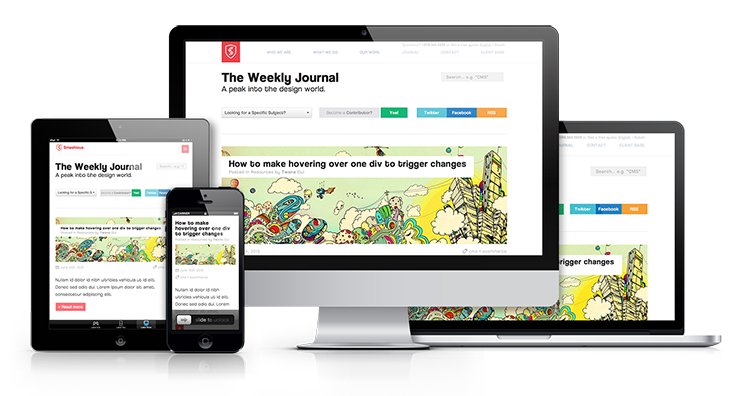
The number of mobile phone users has surpassed the number of PC owners and we see that more and more people rely on mobile phones to access the internet. According to a statistic; around 31 million people solely use mobiles to access the internet in the US alone. Hence, websites that are not responsive are loosing out on potential sales. While designing mobile websites it is important that the mobile versions be carefully crafted to make optimum use of smaller screen space. Here, it is recommended that these websites be simple and uncluttered and should include all the functionalities of the desktop website.
6. Hidden menus

Hidden menus surfaced in 2015 however their appeal has only grown stronger in 2016. Hidden menus are navigations that appear when a user hovers over a particular section of the website. These menus direct users towards a necessary call to actions pertaining to that particular section. The use of these hidden menus not only makes the website easy to navigate but also increases the usability of the website manifolds by giving it an interactive and cognitive feel.
7. Speed analysis
An aspect that can not be overrated is the loading time of websites. Research indicates that 40% of website visitors leave if a web page takes more than 3 seconds to load. Hence, it is important that the loading time is reduced as much as possible to increase your website’s user-friendliness. This can be facilitated by using a minimalist approach to web design.
The use of these steps can instantly make your website more user-friendly.


