Well, today, who wouldn’t want the visitors who come to a particular website to make a purchase before them logging out of their screens? Alas, in reality, we come across very low website conversion rates, mostly due to inefficiency of the website.
Hence, an appealing website design is significant, but you can’t avoid what your website is really meant for. Without actions such as converting traffic into lead form submissions, contact form submissions, sales etc. your business will not be able to generate value. Obviously, the more conversions your website produces, the more revenue your business is going to produce!
Incremental Optimization
Increasing your website’s conversion rates is absolutely important. Hence, having a good conversion rate is the foundation of high sales volume.
For example, you set a goal to increase your sales by 50%. So, how would you do it? With more advertising budget maybe? Producing 50% more content? Or putting in 50% more time, effort and money into marketing? These tactics could work, but it is more important to increase your conversion rate. Because, if your conversion rate goes up from 2% to 3%, it is actually a 50% uplift in results!
Integrating a minor tweak in your website can lead to significant improvement in your website’s conversion rates leading to a dramatic increase in your results. What if that tweak is the ‘Use of Bigger, Better Images’?
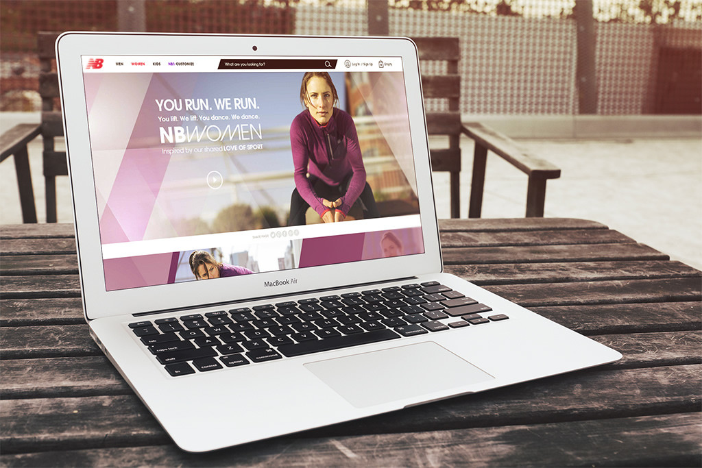
Images not only add a life to a website, they also make it convert better. Nowadays, attention span is short and people no longer have time to browse through a website – they want to experience it. Hence, using the right images can boost up your site’s conversions and help you connect with your target audience. Here’s how intelligently using bigger images in your website can help!
Bigger images are said to result in higher conversion rates. It’s just that simple, as when you increase the size of an image, it becomes more noticeable, less bounce-worthy & more likely that the visitor will convert.
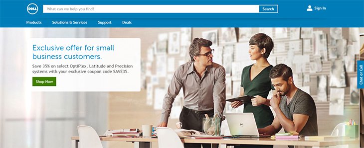
Dell had also tested versions of their expert consultation page. Here are the reports:

According to the reports, it reduced bounce rates by 27% and improved conversions by 36%.
Observe that in the above Dell example, despite the tangential relationship of the image to the service being sold, the larger image produced improved conversions.
“Therefore, Bigger is always better, regardless of what you’re selling!”
Customers who make purchases online are usually unable to touch or feel the product they intend to buy. So, allow them to make a more informed decision with some of the stunning product shots.
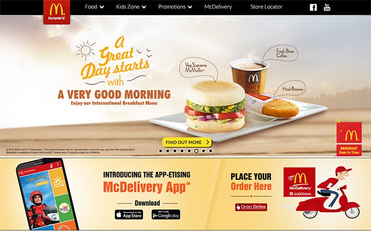
Similarly, McDonald’s’ homepage shows off new menu items with huge images, but they go further on the product pages: to display the juicy tastiness of its burgers, the site displays them life-size.

On its homepage, Walmart uses mega-images in its slideshow that introduces shoppers to various categories and sales on its website. These mega-images are useful because they grab the attention of site visitors to whatever specific offer or sale the company has to go on at the moment.

So don’t struggle, just figure out where you might be missing the mark and fix it before it costs you millions of dollars in lost conversions, a Web Designing Company in India.


