A compelling website has many leading facets that contribute towards its potential to attract end-user traffic and generate sales. When you ask any design expert for his or her opinion on the non-negotiable elements of a powerful website design, you would most often than not hear about the need to manifest rich and intriguing content, user-friendly navigational menus and search options, easily traceable contact information and appealing aesthetics such as an appropriate colour scheme, readable and eye-catching font style, stunning visuals and the likes. While these are certainly irrefutable components of a great website and play a vital role in attracting prospects at a visceral level, the matter of fact is that if you ask yourself about the one thing that keeps you hooked on to any website for long, the answer in all probability would be, “I am able to relate to this website”. So, what makes a website so relatable to any user? Well, apart from the aforementioned features, any riveting website must make use of emotional design to strike a chord with its readers effortlessly. If you are in a dilemma about the need to integrate emotions into your website design, then read on to know more about the far-reaching effects of emotional design in creating a superlative user experience that transcends the set boundaries of a website in context to its ability to delight its visitors with its rich source of information and its interactive interface.
What is Emotional Design?

Simply put, an emotional design is a design style that elicits emotions from its readers at a reflective level. Emotions are intrinsic to all human beings though the degree of their intensity may vary from person to person. Many times, our decisions are influenced not just by our rationality or practicality alone but also by our underlying emotions. We feel more engaged with a product or a service if it is able to motivate or inspire us and has a feel-good factor associated with it. Likewise, a website might attract first-time visitors on the basis of its SEO proficiency, attractive facade, and neat content. However, it will only be able to retain their interest for a substantial period of time if its content and graphics are meaningful and enriched with emotions. Hence, it is imperative for web designers to realize and acknowledge the significance of factoring in human emotions while designing the overall look and feel of a website.
What is Not an Emotional Design?
Someone rightly said, “Emotions and feelings in life are like water in the ocean which will never dry”. Okay, so you designed the website keeping in mind that it should be able to illustrate the message that you intend to convey in a lucid manner. However, you must remember that a website is not limited to being an informative storehouse that is loaded with zillions of facts and other nitty-gritties. It has to be personalized to echo with a customer’s emotions and sentiments too. Imagine yourself stumbling upon a vivid website that is a living encyclopedia but devoid of emotions. Case in point is your run-of-the-mill financial sites that are often inundated with intelligent offers and practical suggestions that can do wonders for your savings but don’t really have much impact as they fail to draw out any emotion from their visitors. This is in stark contrast to the successful ecommerce websites that play heavily on the emotional quotient of their target consumers.
Another important aspect is the usage of humour as part of the emotional design. Now, we all know how humour is outright infectious and can be harnessed as an effective technique to deliver crucial messages in a light-hearted manner. However, it is important to balance the element of humour in your website as overuse of humour can be perceived as crass and frivolous. Similarly, not everyone appreciates humour in a like-minded fashion and its definition changes vastly from one to the other. So, it is best to deploy it in a subtle manner so that you can break the ice with your users without coming across as condescending or demeaning.
Another important aspect is the usage of humour as part of the emotional design. Now, we all know how humour is outright infectious and can be harnessed as an effective technique to deliver crucial messages in a light-hearted manner. However, it is important to balance the element of humour in your website as overuse of humour can be perceived as crass and frivolous. Similarly, not everyone appreciates humour in a like-minded fashion and its definition changes vastly from one to the other. So, it is best to deploy it in a subtle manner so that you can break the ice with your users without coming across as condescending or demeaning.
How to Incorporate Emotional Design into Your Website?
Identify your website theme and formulate the design accordingly
Before choosing an appropriate emotional design, you must discern the theme of your website and the message that you would like to disseminate. Carefully weigh out if your theme is informative and serious such as a banking site or a cheerful and fun-filled read such as a travel portal. Accordingly, decide what emotion you need to enhance and what needs to be underplayed. It is equally important to identify your target audience and formulate the content in a style that resonates with them. Knowing what does not work with your prospects is an integral aspect and care should be taken so that you can avoid any design style that contradicts their values and beliefs or keep such style to a bare minimal if it is simply unavoidable. Do ensure though that your organization’s image is not diluted in the process of tweaking your website design and content according to the end user’s taste and preferences.
Keep the emotions consistent throughout the website

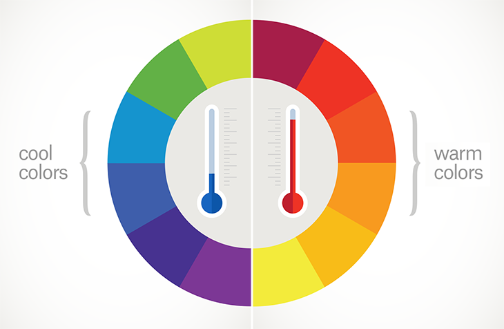
It is essential that your website does not echo your confused state of mind by portraying emotions that range from ecstatic notes to sombre sermons. Keep the tone and the emotion of your website consistent with your choice of color, nature of a content, usage of a logo, font style, and other design elements. For example, if your website is a gastronomic haven, then you would probably not want to experiment with too much of blue which signifies tranquility and calmness. Rather, red and yellow are good choices as they demonstrate passion and buoyancy. No wonder they are often our ‘go-to’ colours when we think of suitable colours for our kitchens and dining rooms. If your website is targeted towards the intellectual audience, then a soul-searching, probing and thought-provoking content style should be the norm while simple and joyful text will appeal to the parents if your website promises to be a one-stop parenting guide for all the guardians out there.
Enliven Your Emotions with Images and Videos

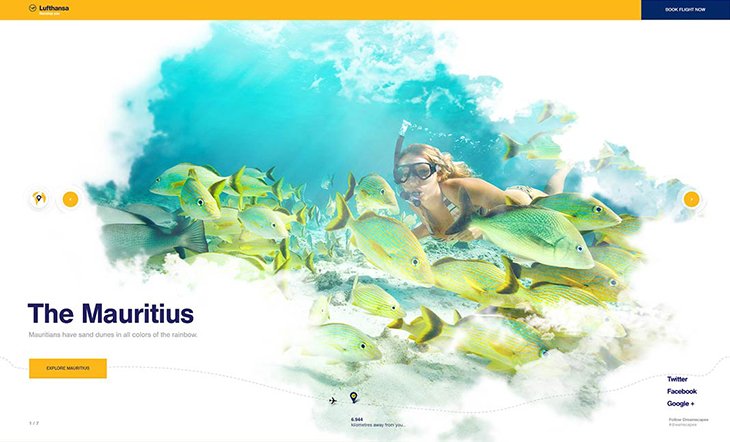
Images and videos are new-age tools to break the monotony of boring texts. Accentuate your website theme with descriptive and vivid images and logos. They save you from having to invent creative content endlessly and there is something irresistible about the wordless images and the engrossing videos that attract visitors much more than the plain content. Take the case of PepsiCo for example. Food and beverage major, PepsiCo, undertook a massive campaign last year when it decided to welcome emojis on its cola bottles. Coaxing its consumers to communicate with each other with its emojis in an otherwise incommunicado environment or situation, the unique ‘Say it with Pepsi’ campaign became a runaway hit. Establish a deep-seated relationship with your visitors by allowing pictures and videos to narrate your story. Do keep in mind to amplify the pictures well enough so that the reader gets an up, close and personal view rather harbouring a distant feeling with an image that is too small and does nothing to evoke his or her senses. Lastly, make use of videos that exhibit an appropriate conversational tone that befits the gravity of your website’s theme.
There you go…few simple techniques shared with you for designing an evocative masterpiece that is enlightening and engaging without bordering on excessiveness in any form. As Aarron Walter aptly stated, “Emotional design turns casual users into fanatics, ready to tell others about their positive experience”.


